
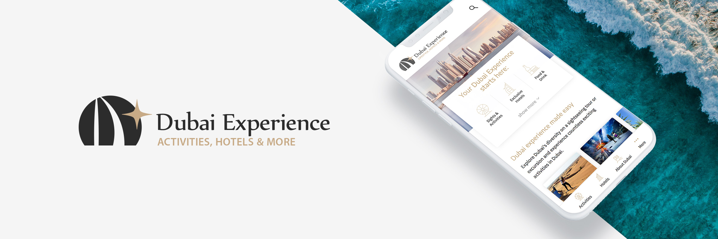
Dubai Experience – a Mobile-First Online Travel Portal
The online travel portal Dubai-Exclusive-Hotels.com was rebranded and relaunched to better deliver a holistic travel experience and widen the offering. Based on qualitative and quantitative user research, the website Dubai-Experience.com was launched with a new corporate design, information architecture, and mobile-first web design.
- PROJECT TYPE
Digital Product - MY ROLE
UX / UI Designer, Developer - DURATION
Six Months - TEAM SETUP
2 UX Designer, 1 Developer, Freelance Editors
Objective
In 2015, I co-founded the German travel portal Dubai-Exclusive-Hotels.com which became a sought-after resource for Dubai travellers in the DACH market. However, we adjusted our initial business focus on selling stays in Dubai and didn’t want to solely concentrate on hotels in Dubai anymore but on the whole set: Activities, tours, hotels, and travel information. Driven by the idea of holism and storytelling, our brand should express that we from now on take care of and shape the individual’s Dubai Experience.
As part of this measure, we also aimed to optimize our historically grown information architecture and take account of the – in the meantime – 73 % mobile users with a mobile-first approach on our web design and setup. Based on an enriched range of information for DACH users, we also expanded to the English-speaking market with this relaunch. This case study gives an overview of the different stages of our work towards the rebrand and relaunch.
Survey
STOCKTAKING & KNOWING OUR CUSTOMERS
We approached the relaunch by asking our customers what they liked on our old website, why they are visiting our offer, etc. and some general topics like what a good travel website makes for them, what’s annoying on our and other websites. Also, we asked in which stages of travel preparation they currently are and with whom they travel. To get a broad overview and get a feeling of what the majorities think, we decided to create a survey with qualitative as well as with quantitative parts. The survey was answered by 71 respondents and evaluated afterwards.

Results from the web-based survey that helped us to shape the new website, prioritize contents and align our offering according to the user needs.
Information Architecture
Developing an Expandable Information Architecture
Our new information architecture (IA) should be easy to understand, match the user’s main goals and be expandable for new contents in the future. Another objective was to create a structure that takes advantage of a powerful SEO strategy which proposes cornerstone contents / topic clusters. Therefore, we did a card sorting session to collect, synthesize, and cluster our legacy contents. We established a three-level structure of main clusters, sub clusters, and the ultimate article layer. The new structure was also validated with extensive keyword research to assess the impact on organic traffic.

Resulting information architecture exemplified with the category 'Sights & Activities'
Wireframes
Sketching and Organizing Contents
As the whole project is about to create a holistic (Dubai) experience, we also redefined the reader's experience. Therefore, we created wireframes that depict different types of content layouts. Together with a small group of users, we discussed the wireframes and did several iterations from low to high fidelity. Hereby, a component-based approach along the lines of Brad Frost’s Atomic Design turned out to be valuable:
Components enabled us to craft article layouts that are flexible and only contain the necessary parts but can take advantage of different elements that enrich the reader's experience. Furthermore, the component-based approach improves the design’s consistency and clarity which was claimed by our customers. And in the end, working with a pattern library of components, templates, etc. heavily speeds up the development process and makes the website maintainable.
Design Language
Creating a Modern Arabian Flair
Travelling is about emotions and adventures. Therefore, we wanted to create a light web design that works well with tempting images and embodies clarity, solidity, and professionalism. Besides our already existing secondary sand color (depicting Dubai’s deserts), we introduced a new petrol-like hue which brings the Persian Gulf right into the visitor’s browsers. We also created a repeatable Arabian pattern which creates an Arabian flair. The body font "Source Sans Pro" was mainly chosen for its good readability which is necessary for small font sizes on smaller screens.

User Interface Design
The Eventual Web Design
With the past research, discussions, desires but also no-gos in mind, we created a web design which satisfies the user needs. The design makes our content explorable, supports visitors in the inspiration phase for hotels and activity planning, and has high clarity. Since the respondents of the survey reported a mediocre-to-good trust in our old brand, another objective was it to improve the trust in our brand and take into account the customers' desire to book their stays with large companies. Several trust-promoting and transparency-enabling elements were introduced: A small company mission description in the page footer, our affiliate partner logos (Booking.com, GetYourGuide, Lastminute.com, etc.), easy to find contact possibilities as well as disclosing more details about our approach within the texts.
Go to WebsiteMobile Screenshots

Learnings
What I've learned from this project
- I was amazed by the willingness of our survey subjects to participate in future user research activities. About 35 % of the respondents signed up for our research activities mailing list without any incentives being mentioned.
- We – again – decided to develop our new online portal as a WordPress solution. Despite the fact that there are big rumours around WordPress new Gutenberg editor, I can tell: Gutenberg is ready for productive development. And it’s a very powerful solution especially when a component-based (Atomic Design) design should be implemented. However, the one or other compromise must be made code-wise and the GitHub community is your constant companion.
- We are never done: The research process and insights revealed so many possibilities that we’d like to (A/B) test in the future to steadily improve our user’s experience.
- Cornerstone content pays out:
We tripled our organic traffic within 3 months after the relaunch in September 2019.
Desktop Screenshots
