CONTACT App – Between Earth and You.
The multi-functional shoe insole CONTACT can be connected via Bluetooth with the accompanying app and helps to prevent foot diseases, encourages people to do their daily workout, and offers relaxing wellness features.
- PROJECT TYPE
University Project - MY ROLE
UX / UI Designer - DURATION
Two Months - TEAM SETUP
2 UX Designer, 1 Industrial Designer
Project Info
A collaboration between the Queensland University of Technology (Australia) and the Technische Hochschule Ingolstadt (Germany) was established to explore the emerging field of the Internet of Things in connection in the area of digital health. Within this project, we worked together with Ellie Daubney (Industrial Designer @ QUT) who developed the idea of a multi-sensory sock which offers promising dance therapy possibilities. Inspired by Ellie’s idea of a sensory device that collects data from the feet, Benjamin Homm and me created the concept for the CONTACT insole.
Our concept got published in Germany’s leading design magazine PAGE and received the best mark (1.0). The project was lead by Prof. Ingrid Stahl (THI) and co-supervised by Dr Marianella Chamorro-Koc (QUT).
Problem & Objective
Between 10–30 % of the population at some point in time get footsore and suffer from either a heel spur, inflammation of the foot, or had a foot fungus. Besides a predisposition, those problems are mainly caused by shoes that don’t fit well, an unsanitary shoe interior, or even wrong exposure. The goal of this project was it, to explore how an IoT device could help to prevent and heal the related foot issues. This could be reached through a habit-forming app which is fully integrated into a user’s everyday life and sports activities.

CONTACT's intended fields of application
Literature Review, User Interviews & Personas
Searching for Information on a Novel Topic
Since foot diseases and one’s latest fungus are a relatively uncommon topic and we were certainly not pros within this domain, we first needed to dig into the medical foundations by reviewing the literature. Hereby, we learned that such foot issues can often be prevented by maintaining a hygienic condition inside the shoes, buying shoes with a correct fit, and exposing the feet the right way. Also, these types of foot issues are problems everybody can encounter no matter how old, if female or male, etc. To better understand potential users and their motivations, concerns, and goals, we conducted user interviews with six people (friends, family, and students).
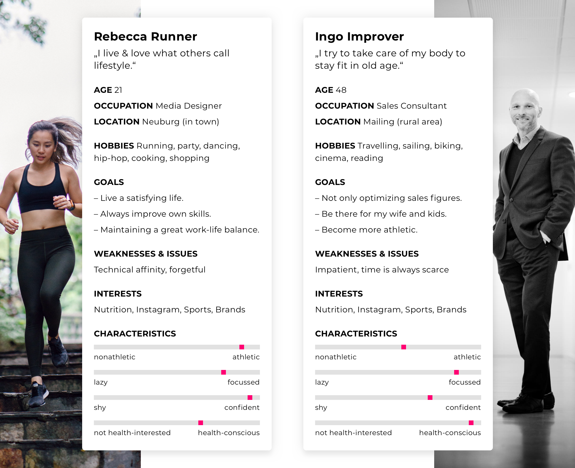
Hereby, we were able to identify two potential user groups for this novel product and derived two personas: Users like Rebecca Runner who appreciates health, however, sees it more as something obligatory and a positive side effect of her lifestyle. But she doesn’t want to make it a central topic. The other persona is Ingo Improver who is willing to improve his health and appreciates products that help him to become a fitter individual. Ingo is strongly related to our subjects of mid-higher age (47-65), while Rebecca represents the views of our younger participants.

Prototyping
Paper, Pencils, Post-Its, People, (P)insights.
Building on the personas, we tried to create a concept that satisfies both the lifestyle user and the active health improver. To take account of the latter’s needs, we proposed our core concept of the Bluetooth insole that can be connected with the app. Inside the app, the user gets live data about his foot exposure and sees how he performs in the long run with an analysis and a forecast of his foot health. Whereas users like Rebecca Runner may be more attracted by the integrated fitness app-like experience which connects working out with live data right out of the shoes. Plus we also thought of a gimmick that makes the insole a good companion during cold days and explored an heating-option.
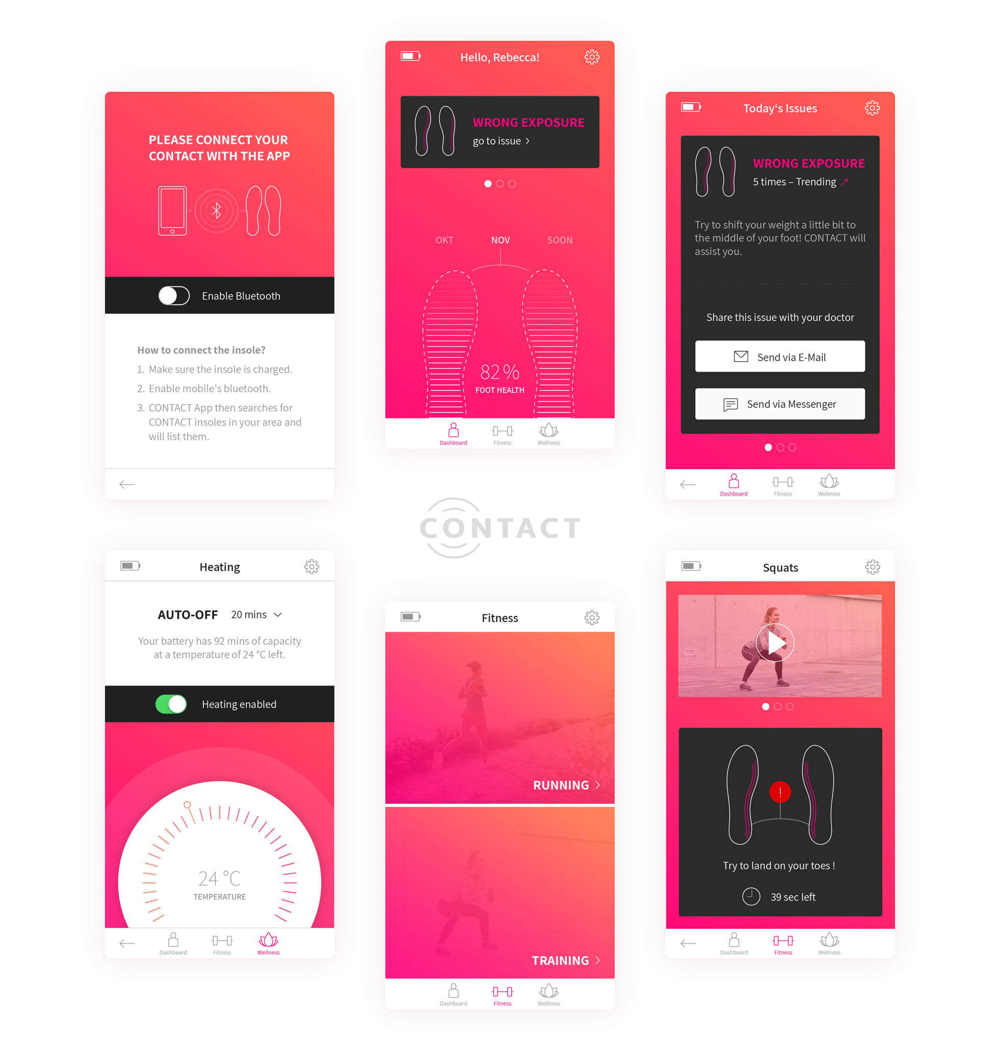
- Dashboard
Central place that shows the user’s foot health and offers a forecast to motivate the users to take action. The Dashboard also shows the latest issues that were tracked while using the insole. - Fitness
Workout-mode with exercise "how-tos" and running-mode with visual and auditive (while running) live-exposure of the feet. - Wellness
Heating-function and massage-function to improve the blood flow.
Despite the fact that the focus within this project lay on the user interface design and exploration of IoT devices in digital health rather than on the hardware, we also investigated issues like feasibility. Especially the heating feature and the exposure tracking sensors required infrastructure to reload the insoles. A solution was also needed to disinfect the insoles (remember, insanity also leads to feet diseases). Together with our prototype testers, the idea of a small docking and disinfecting station emerged.
Paper prototyping helped us to understand the whole user journey as well as giving us a good sense for the hardware sizes. The paper prototypes also indicated that the docking station must not be larger than it requires since – especially young users – have only a little space left in their apartments.
Wireframes were created to discuss and plan the definite UI design and a paper prototype was also used for early user tests.
Hybrid App User Interface Design
Creating a supportive & fresh design.
Our qualitative research showed, that – understandably – foot health isn’t a topic everyone is into and everyone constantly checks. Thus, we made one’s feet health the central and approachable spot within our app. The dashboard informs the users about their current foot health and also motivates to act with a forecast for the future which level can be achieved by taking action. Our user interface (hybrid design) allows the user to quickly navigate between the core functions of foot health (dashboard), fitness, and wellness features like the heating-function and massage function. For the UI design, we also created lots of (micro) animations to create a guiding, modern and dynamic look and feel.
Parts of the app can be also seen in the following video showing Rebecca Runner’s journey with the app, insole, and docking station.

Learnings
What I've learned from this project
- It took us quite a few discussions and iterations on how we visualize foot health in an informative and clear way. The problem with foot health was that our participants had no clear idea of what foot health might be. Therefore, we decided to go with a combined foot health scale in the shape of a sole to use the foot metaphor and provide an easy entry to an abstract topic. Sometimes, less is enough and better understandable.
- Foot health isn't sexy. But necessary.

