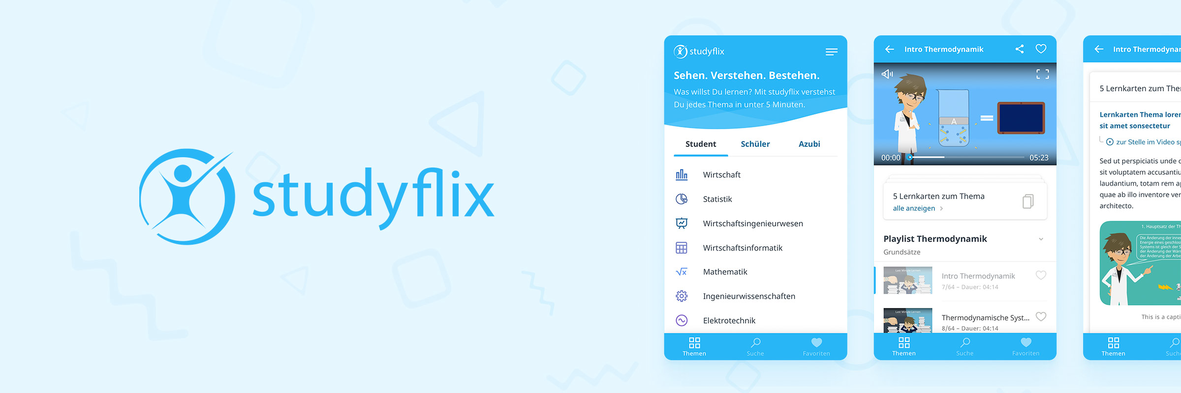
Studyflix App – Launch of an E-learning App for Students and Pupils
More than four million students and pupils use Studyflix every month to prepare for their exams with the help of Studyflix’s free educational videos. I led the UI design creation for their new iOS and Android app which ranks among the most downloaded and best-reviewed education apps.
This page features a mini case study to give you a glimpse of the project. An extensive case study will follow.
- PROJECT TYPE
iOS and Android App - MY ROLE
Lead UX/UI Designer - DURATION
Two Months - TEAM SETUP
2 UX & UI Designers, 1 PM, 3 Devs
Results
- The app is a phenomenal success story for the whole team: The iOS and Android apps together were downloaded more than 300.000 times so far and have an average rating of 4.8 stars (7500+ reviews) in both app stores.
- Although the app and its contents are available in German only, it still ranks among the Top 50–100 education apps worldwide (no stats for Germany-only available).
- Following this success, Studyflix chose to hire me for the concept and design of their new job platform and redesign of the website which was launched in June 2022 – check out studyflix.de/jobs. Stay tuned for an extensive case study about this project.
Challenge
My long-term client Studyflix – for which I worked on various UX/UI topics on their website before and continue to do so – asked me to create a concept and design for their new app. The Studyflix app was launched to complement their existing website and deliver a cutting-edge user experience for mobile users. With the new app, we also introduced easily digestible flashcards to improve the learning experience.
Collaboration and Approach
Due to the tight time frame of only two months from kick-off to development, I decided to co-design the app together with Pascal Jeschke whom I have previously worked with at AutoScout24.
Together with the Product Manager, we kicked off the project to gather requirements and subsequently visualised Studyflix needs as wireframes.
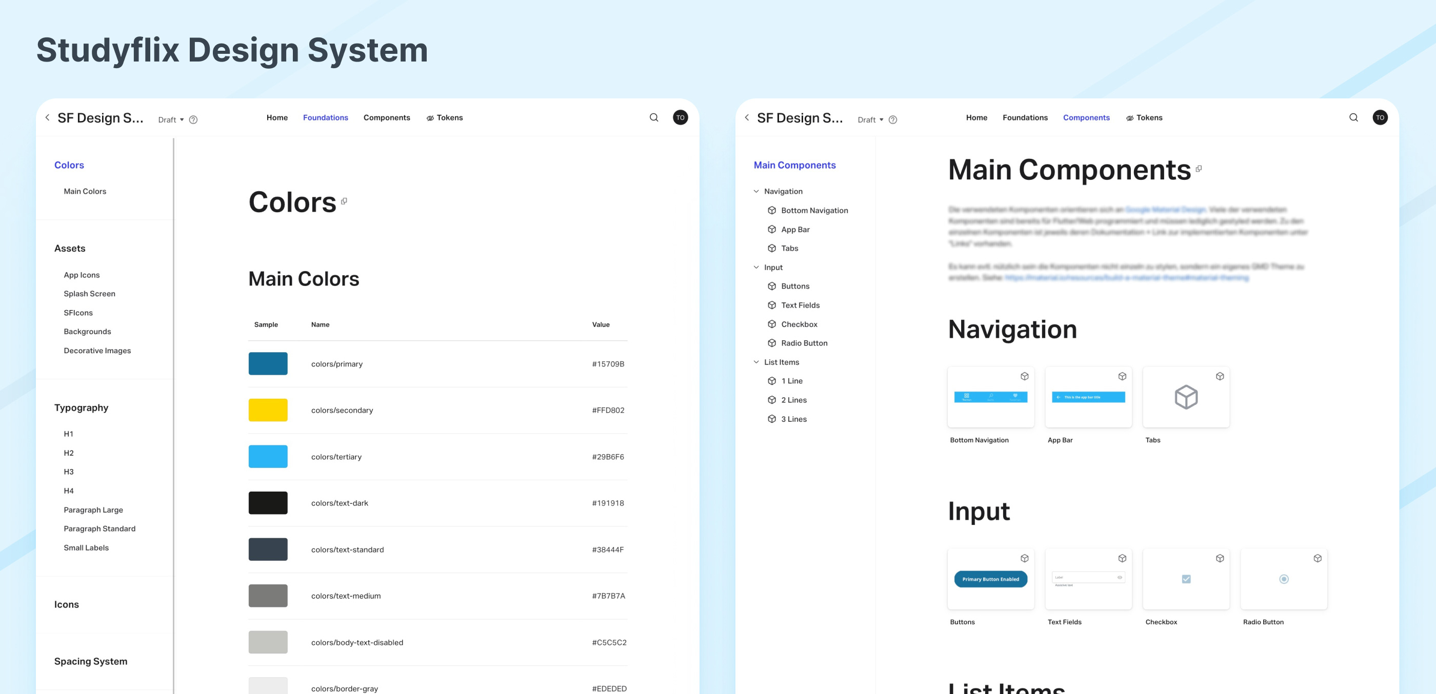
Following that, Pascal was mostly concerned with translating the web experience to an app experience, while I focused on the design of the core screens with the new flashcards feature and built up a design system and documentation. Our collaboration included both, co-design sessions and parts that were carried out by us individually. However, to create a coherent app, we regularly held design review meetings and aligned our work.
Solution
To go forward with the project quickly and at the same time deliver a compelling user interface design, we decided to base our design on Google's Material Design language and components. We created a custom set of design components matching Studyflix’s web design. While the screens of the app looked similar on both platforms, we customised some design components according to platform standards where crucial. Our designs were tested and improved based on feedback gathered in small user testing sessions.

Design System and Documentation (InVision DSM)

